A memorable medal is a small object carrying a large story. It may recognize service, mark a championship, commemorate an anniversary, or represent membership in a community. The designer has only a few centimeters, shallow relief, limited contrast, and materials that will be touched, worn, photographed, and kept for years. Good medal design is therefore less about adding decoration and more about deciding what deserves to remain.
This guide takes a medal design from brief to production. It covers symbolism, composition, relief, lettering, the reverse, edge, ribbon, metal finishes, accessibility, manufacturing constraints, and proofing. It applies to struck medals, cast medals, challenge coins, awards, and commemorative pieces, though the maker’s process should always shape the final specifications.
Core principles
- Write the meaning in one sentence before drawing.
- Choose one dominant symbol and a clear hierarchy.
- Design for relief and light, not a full-color screen.
- Make lettering larger and simpler than it looks on a monitor.
- Treat obverse, reverse, edge, and ribbon as one system.
- Request a physical proof or test strike before full production.
Begin with a design brief
A brief prevents the committee from solving every disagreement by adding another symbol. Define:
- Purpose: achievement, service, commemoration, membership, or participation
- Recipient and audience
- Single most important message
- Required words, dates, names, or official marks
- Dimensions, budget, quantity, deadline, and presentation method
- Manufacturing process and supplier constraints
- Approval authority and legal review
- Accessibility and cultural considerations
Complete this sentence: “When the recipient holds the medal, it should communicate ___.” If the answer needs a paragraph, the concept is not focused enough.
Research before choosing symbols
A torch can mean knowledge, remembrance, liberty, or athletic competition. A laurel can signal victory but may feel generic. An animal may carry local, religious, national, military, or political meanings the designer did not intend. Research the symbol in the recipient’s cultural context and check whether it is protected, sacred, contested, or overused.
For a person, place, or historical event, use reliable source material. The U.S. Mint notes that medallic artists research objects, people, and landscapes before turning approved line art into sculpture. Accuracy matters because shallow relief can amplify a small error into the defining feature.
Build a visual hierarchy
At arm’s length, the viewer should see one dominant mass. At hand distance, secondary symbols and words become clear. Under close inspection, texture and small details reward attention. If everything has equal weight, nothing leads.
A reliable hierarchy might be:
- Primary portrait, figure, emblem, or abstract shape
- Short title or organization name
- Supporting symbol, date, or location
- Fine texture, maker’s mark, or edge inscription
Print the design at actual size and squint. If the main idea disappears, simplify. A large monitor encourages details the die, casting, finish, and eye cannot preserve.
Think in relief, not line art
A medal is read through light and shadow across raised and recessed surfaces. A dark line in a drawing may become a ridge, a groove, a change in height, or nothing at all. Ask how every important boundary will exist physically.
Low relief must compress depth. A portrait’s nose cannot project in realistic proportion, and overlapping figures need carefully stepped planes. High points must avoid becoming isolated needles that fail to fill, wear quickly, or prevent an even strike.
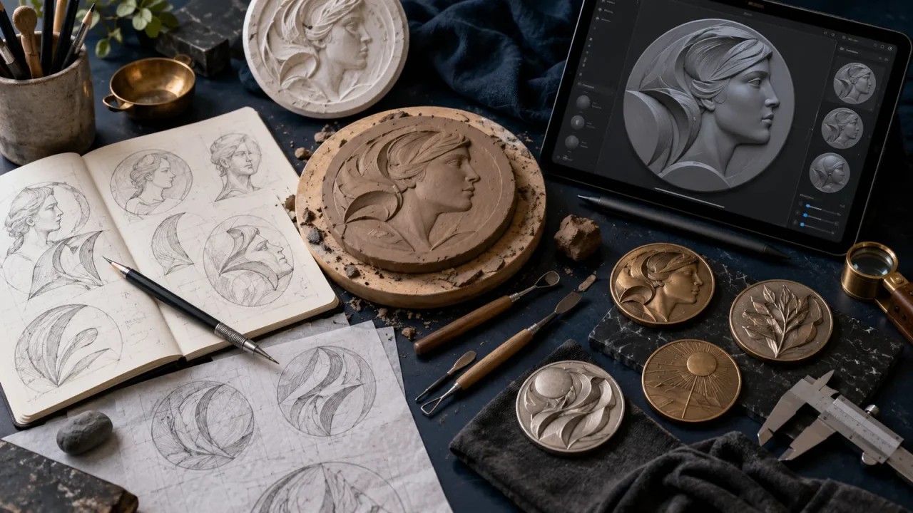
The U.S. Mint’s process moves from line drawing to clay, plaster, or digital sculpture, then to a digital model, master tooling, dies, and a test strike. That transition is where production knowledge protects artistic intent.
Use silhouette and negative space
Strong medals often work first as silhouettes. Negative space separates a profile from a background, a hand from a tool, or an emblem from lettering. Crowding the rim with small icons reduces both clarity and die life.
On pierced or openwork medals, negative space becomes structural. Thin bridges can bend or fail, and sharp inside corners concentrate stress. The manufacturer should review minimum thickness and radius early.
Lettering that survives production
Text is one of the most common failure points. Use a typeface with open counters, sturdy strokes, and clear spacing. Extremely light, condensed, or ornate fonts may close up in a strike or fill poorly in casting. Curved text needs optical spacing; software’s automatic letter spacing often looks uneven on an arc.
Keep wording brief. Confirm spelling, accents, capitalization, dates, ranks, and honorifics with the approval authority. Proof names separately. A flawless sculpt with a misspelled recipient is still a failed medal.
Ask the producer for minimum raised-line width, recessed-line width, letter height, spacing, and relief depth for the chosen diameter and metal. These are process limits, not aesthetic opinions.
Design the reverse with purpose
The reverse is not leftover space. It can carry a secondary scene, values, a map, event details, recipient-name area, serial number, or a quiet field for engraving. A strong obverse and weak reverse make the object feel incomplete when handled.
Consider rotational alignment. Coin alignment and medal alignment rotate differently when the object is flipped. Specify which orientation the maker should use. If a loop or ribbon suspension fixes “up,” verify both sides against it.
Use the edge
The edge can carry a serial number, recipient name, date, motto, security feature, or texture. Edge lettering may be applied during striking, in a separate operation, by laser, or by engraving. Each method changes cost and minimum size.
Do not put essential public information only on the edge; it is hard to photograph and may be hidden by a mount. Use it for personal or secondary detail.
Choose shape and size intentionally
A circular medal feels formal and rotates naturally. Shields imply protection or institution; irregular outlines can reinforce a symbol but cost more and create sharp or weak points. Very large medals offer sculptural presence but become heavy to wear. Very small medals simplify poorly.
Mock up weight using a blank disk or 3D print. A design that looks impressive on screen may pull uncomfortably on a ribbon or hang unevenly. Balance the suspension point above the center of mass.
Ribbon design is part of the object
Ribbon colors may identify organization, rank, event, nation, or category. Limit the palette and check contrast under daylight and artificial light. Narrow stripes can merge at a distance or in photographs. Avoid relying on color alone to distinguish award levels; combine color with pattern, edge treatment, a bar, or a clearly different medal detail.
Test the ribbon against uniforms or clothing and verify color meanings in context. Specify fiber, weave, width, length, attachment, sewing, and hardware finish. A premium medal on weak hardware fails as a product.
Material and finish
Bronze, brass, copper alloys, zinc alloys, steel, silver, and precious metals each affect weight, color, cost, strike behavior, casting detail, corrosion, and finish. Plating creates a surface color but can wear through on high points. Antiquing darkens recesses to increase contrast. Sandblasting, polishing, and selective frosting separate planes.
Enamel adds color but changes the design language from pure relief to outlined compartments. Hard and soft enamel processes have different surface and cost characteristics. Printed color allows gradients but may feel less integral and may wear differently.
Ask about nickel and other allergen requirements for wearable products in the target market. Specify whether the medal is a display object, frequently handled token, or long-worn award.
Struck, cast, or machined?
Struck medals
Dies press the design into a blank, producing crisp relief and a traditional medallic character. Tooling cost is higher, and relief, metal flow, and press capacity constrain design. Multiple strikes and annealing may be needed for deeper work.
Cast medals
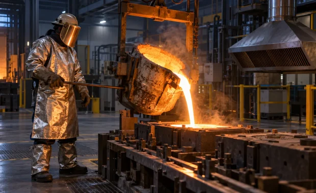
Molten metal fills a mold. Casting supports irregular shape, deeper relief, and some openwork, but fine surface and edges differ from striking. Mold lines, shrinkage, porosity, and finishing need control.
Machined or laser-made pieces
CNC machining and laser engraving suit small runs, personalization, and modern geometric aesthetics. They do not automatically replicate sculpted relief. Choose the process for the intended visual language, quantity, and budget.
From sketch to production model
- Create many small thumbnail concepts.
- Select two or three against the written brief.
- Draw at larger scale while continuously checking actual size.
- Resolve text, rim, fields, and all required elements.
- Build the relief in clay, plaster, or digital sculpting software.
- Generate renders under several light directions.
- Review a 3D print or milled model if appropriate.
- Have the manufacturer perform a technical review.
- Produce a proof or test strike.
- Correct tooling or finish before full production.
A render is not a proof. It cannot fully predict metal flow, polish, plating, edge behavior, ribbon balance, or how relief reads in moving light.
Evaluate the proof
Inspect under side light, diffuse light, and ordinary room light. Photograph it at actual display size. Check whether the portrait reads, letters remain open, high points fill, recessed areas are clean, texture supports rather than muddies the image, and the reverse orientation is correct.
Measure diameter, thickness, mass, ribbon width, attachment strength, and color against approved samples. Rub high points and handle the edge. If medals will be engraved, test the actual engraving process on the proof material and finish.
Accessibility and inclusion
Use tactile distinctions where practical: different edge textures, shapes, relief patterns, or ribbon structures can help distinguish categories without color alone. Provide accessible digital descriptions for ceremonies and catalogs. Check whether imagery represents the intended community without stereotype or tokenism.
For a public award, explain the symbol and process in plain language. A medal’s meaning should not be locked behind insider knowledge.
Common design mistakes
- Trying to include every stakeholder symbol
- Using a logo without adapting it to relief
- Choosing tiny type after viewing only a zoomed screen
- Ignoring the reverse and edge
- Approving a render without a physical proof
- Using gradients that the chosen process cannot reproduce
- Copying historic medals or protected emblems without rights
- Adding a ribbon at the end without testing balance and attachment
- Letting the committee revise by accumulation instead of choosing a concept
Concept prompts that lead to original work
Rather than copying a stock laurel, start with a relationship: a river becoming a road for a service award; hands forming negative space around a seed for community stewardship; a local topographic line merging into a waveform for scientific communication; an unfinished arc completed on the reverse for mentorship.
Each idea should connect directly to the brief and remain legible in relief. Originality is not strangeness; it is a specific solution to a specific story.
Frequently asked questions
How many words should be on a medal?
As few as the purpose allows. Name, honor, organization, and date may be enough. Longer citations belong on a certificate or presentation page.
Should a medal use a portrait?
Only when the person is central and rights, source accuracy, representation, and approval are resolved. Symbolic designs can age better than a weak portrait.
What file should go to the manufacturer?
Ask the manufacturer. Common deliverables include vector line art, high-resolution relief models, dimensioned drawings, color and finish specifications, fonts converted appropriately, and reference renders.
How do I protect an original design?
Keep dated records, use clear contracts that define copyright, tooling ownership, reuse, and attribution, and obtain legal advice for important commissions.
Bottom line
A strong medal reduces a story to a form that still speaks when words are small and color disappears. Start with one message, research symbols, design in relief, respect production limits, integrate every surface, and insist on a physical proof. The result should feel inevitable in the hand: clear from a distance, rewarding up close, and worthy of the person receiving it.
Sources
- United States Mint: Artistic sculpting process
- United States Mint: Design and selection process
- United States Mint: Die making
Evidence reviewed: October 16, 2026.